How To Design An Effective Pull-Up Banner
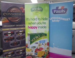
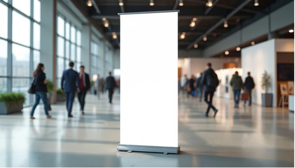
A pull-up banner is a cost-effective and versatile way to communicate your message in busy environments. But because people usually see it from a distance and only for a few seconds, the way information is prioritised matters just as much as the design itself.
An effective pull-up banner uses clear message hierarchy, strong readability and a simple layout to guide the eye from top to bottom.
This guide explains how to structure your content, avoid common layout mistakes and make the most of limited space.
How to Design an Effective Pull-Up Banner: What to Show and Where
- Start with clear message hierarchy
People scan pull-up banners from top to bottom, often while walking past. The most important information should appear at eye level or above, with supporting details placed lower down.
A simple hierarchy works best:
- Top: Logo or brand identifier
- Middle: One clear headline or key message
- Lower section: Supporting information or call to action
Avoid trying to communicate multiple messages at once. A pull-up banner works best when it answers one question clearly, rather than several at once.
- Design for readability from a distance
Pull-up banners are usually viewed from several metres away. Colours, contrast and font size all affect how easily your message can be read at a glance.
- Use strong contrast between text and background
- Avoid light text on light backgrounds
- Be cautious with colour combinations that reduce legibility
Bright colours can attract attention, but readability should always come first. If text can’t be read quickly from a distance, the message will be missed.
- Avoid common layout mistakes
One of the most common mistakes with pull-up banners is trying to include too much information in a small vertical space. What could be some issues to look out for?
- Overcrowded layouts
- Small text blocks that can’t be read from a distance
- Multiple images competing for attention
- Detailed paragraphs instead of short, clear statements
Images should support the message, not overwhelm it. High-quality visuals work best when paired with minimal text and plenty of white space.
Prioritising information in limited space
Pull-up banners are not designed to replace brochures or detailed product information. Their role is to capture attention and prompt the next step.
Before designing your banner, ask:
- What is the single most important message?
- What action should the viewer take next?
- What information can be moved to brochures or flyers?
Read this blog to learn more about signage options for your business: How To Choose the Right Signage for Your Space
A well-designed pull-up banner balances visibility, simplicity and structure. When message hierarchy is clear and layouts are designed for distance viewing, banners become an effective part of any event, retail or promotional setup.
Whether you need a banner stand, retractable banners, or a custom background colour for your marketing material for trade shows, Kwik Kopy make a visual impact.
For guidance on layout, sizing and print quality, speak to your local Kwik Kopy stores about designing and producing pull-up banners that work in real-world environments.
Contact us today to request a quote!

