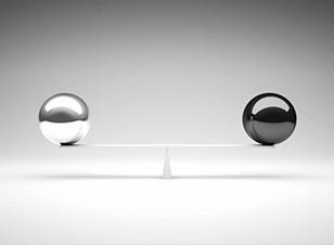
It’s important to understand the principles of design if you’re going to create something that really makes an impact with your audience. These are the concepts used to organise or arrange all the structural elements of the design.
Whether it’s your website or print marketing materials, where you decide to place each element can have a huge effect on how successful a design will be.
Balance in Design
Balance is the distribution of the visual weight of objects such as your logo, text and graphics, together with the use of colour and space. Achieving a balance between these elements helps a design be more pleasing to the eye and stands a much better chance of making a connection with your targets.
But a design doesn’t always need symmetry to achieve balance and in fact, an asymmetrical design can also make a design feel stable.
Symmetry
Symmetrical balance in design is all about creating a mirror image with all your elements, whether it’s your text, colour or images. If you look at the colourful website below, you will see a very strong sense of symmetrical balance.
The same can be said for the poster below, only this time it achieves its symmetrical balance in the design by the large block of white text in the top right corner being mirrored in both colour and shape in the bottom left.
Asymmetry
Asymmetrically balanced layouts are more difficult to design as they don’t have elements that balance each other across a centreline. But the design can be just as effective as can be seen in the website below. It has several elements that don’t reflect each other symmetrically, but due to the colour, texture and content used it still manages to achieve great balance.
So now you know the rules of design balance, but remember (on occasion) rules are made to be broken. A great designer can push the boundaries with a lack of design balance if you need to convey action and motion or just want people to sit up and take notice.
For effective design that gets your business noticed, speak to the team at your local Kwik Kopy today.
Image source: http://www.sitepoint.com/principles-of-good-design-balance/


