Billboards can be the perfect way to make a big statement in your local area. It can instantly capture the attention of your targets with clever ideas, design and placement. A billboard has the potential to put your message right in front of your customers and prospects and when done well, can get people talking to broaden your reach even further.
A creative billboard will jump out at your audience and get your business noticed, just like these fantastic examples…
5 Must-See Billboards To Inspire
1. BBC World
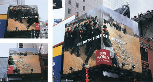
The clever placement of corner billboards on the streets of New York, together with outstanding photography certainly made a big statement when it came to announcing that BBC World was now available in the United States. The images taken from events from around the world were enough to get people talking but add to this the corner placement to provide different takes on the same situation and the result is a simple yet highly effective campaign.
2. The Day after Tomorrow
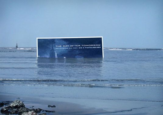
Outdoor promotion is not just about massive billboards on the side of the road as can be seen by this innovative solution for advertising the 2004 disaster movie The Day After Tomorrow to Indian audiences. The billboard was submerged in the sea near Mumbai to try to mimic the idea of Manhattan being overwhelmed by water. To help promote the idea even further, a replica of the Empire State Building was also placed a bit further out to sea. The billboard simply displayed the film’s release date and venue in order to intrigue and entice its audience.
3. Smart: Little Billboard
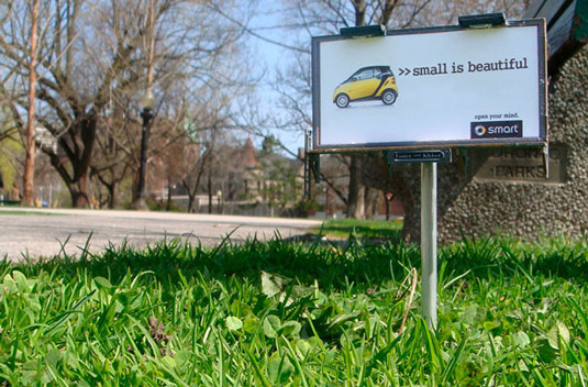
It’s not always size that matters when it comes to your billboard making a big statement, as demonstrated by these itty-bitty billboards in Canada. The campaign promoted Smart Car’s low impact on the environment and these pocket size solutions were perfect for getting the message across. Instead of using large billboards that were not as environmentally-friendly, a series of miniature street advertising boards were placed in various locations around Toronto, each celebrating the beauty of being small.
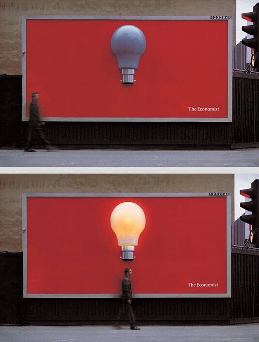
4. The Economist – Light Bulb
We love a bright idea as demonstrated by this billboard promoting the current affairs magazine. It features a giant light bulb popping out of the centre of a red background, with the only words being the publication’s name – The Economist – in the bottom right-hand corner. The billboard uses a motion sensor to detect people walking beneath it and the bulb lights up just at the right moment. A brilliant idea that just goes to show that less really is more.
5. British Airways
British Airways launched a billboard campaign called Look Up that got everyone talking. It is a terrific example of interactive design and channels that childlike excitement of seeing a plane for the first time. The billboard uses custom-built surveillance technology to spot a British Airways plane and updates in real time to display the actual flight number and the destination it is arriving from. Check it out for yourself with this clip of the billboard in Piccadilly Circus, London. If you follow the path of the little boy’s finger as he points to the sky, you’ll see that it is aimed at an actual plane flying overhead. Genius!
Image source: http://www.creativebloq.com

