We have seen all the very best in logo design from one triumph to the next. From Subway and Google to the shining example of Nike’s simplicity, we are surrounded by examples of greatness and design success. Logos are designed to create an association with a brand or product, to stick in the minds of consumers and conjure up a particular feeling to create an action. They need to wrap up brand ideologies, values and promises all in one graphic.
But have you ever thought about the logos that went wrong, the ones that were left behind or the logos that were once iconic but have been tampered with and they now lose all meaning? We have! In this blog we take a look at 5 of the top redesigns that haven’t quite worked.
Underestimating the power of design can have its consequences. The redesign work took place on some of the worlds most iconic and loved brands, however the companies never predicted the adverse reaction which would come from logo changes.
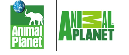
Animal Planet
What’s not to love about the original Animal Planet logo? A cute silhouette of an elephant, a picture of the globe and simple typography created a logo that had integrity, a clear identity and of course was loveable. The logo rang true to their cause, preserving the planet and the earth’s wildlife. However, with the new logo the channel wanted to instead ‘bring out the raw, visceral emotion in the animal kingdom’. More powerful, less soft.
The new logo was designed by London based firm Dunning Eley Jones to meet the brief outlined by Animal Planet. The logo was meant to complement the new programming and “tap into the instincts that drive us all – fear, hunger, pleasure, nurture – with compelling stories that resonate with what it means to be human”.
The logo falls down literally with the M now placed on it’s side in a horizontal position, which doesn’t make much sense. Could it not fit? Is it meant to represent a fallen tree? Is is meant to look more adventurous? The varying sizes of the letters and the mixed colours convey no real clear message. The logo appears to have lost its way with the absence of the globe and the elephant and lacks any really clear meaning.
Yahoo!
The Yahoo! logo redesign was one of the most hyped up flops of logo history. The search engine set out to turn the ship around when it came to how they were perceived, tackling the logo to begin with. There was so much thought and symbolism and big words used to describe the reasoning behind the redesign. The approach towards the logo was a very mathematical process and resulted in an ametuer new design with very little change. We were all expecting a bit more, instead we ended up with a typeface more suited to the 60s and 70s rather than 2013!
Pepsi
Ah Pepsi how we love you so. The second most loved cola in the world. The iconic logo was redesigned in 2013 and despite dropping $1M dollars for the experience, the new logo failed to impress. Again, the logo was designed based on a mathematical, architectural process by the Arnell Group and dealt with the gravitational pull of the earth. Confused yet? So were we.
The tilt upward was meant to represent progress of the company but instead it turned into this:
Gap
Gaps simple logo of a navy box and it’s white iconic typeface was scrapped in favour of a ‘more simple design’ in 2010. That didn’t last long. This logo received such severe backlash from its customers in online forums, that they forced to revert back to the original logo within days of its launch. Sometimes it’s best to stick with what works. Why fix it if it’s not broken?
Kraft
Another iconic logo which did a complete 180. There is a general school of thought when it comes to logo redesign. It’s starts with a simple evolution on a scale of 1 to 10, where 1 is still recognisable and modernized to 10, where it is completely unrecognizable. In this case, if the words ‘Kraft Foods’ weren’t included in this logo we would have no idea who it is!
This logo suffers from overcrowding with a smile under the word ‘kraft’, the colourful graphic off the side of the K and the slogan under the word ‘foods. In the previous logo, the red was iconic, easily identifiable and for some people much loved.
When it’s time for you to redesign your current logo or give it a facelift, it’s always a good idea to consult a designer and decide upon the level of evolution you want to see. Do you want it to be completely unrecognizable or would you prefer just a make over, a nip and tuck here and there? Whatever you decide to do, keep your consumers in mind because in the end, they are your ultimate deciders.
Need help re-designing your logo? Simply, request a quote and our friendly team will be in touch.