Web design is a constantly evolving space. Ever evolving technologies such as mobile devices, marketing tools, high speed internet and applications are driving a constant evolution in both design and functionality.
Below we list 4 of the biggest web design trends for 2013.
#1 – Responsive Web Layouts
The massive growth in the use of mobile devices to access the Internet has resulted in a boom in the demand for responsive web designs. Responsive websites have the ability to adapt their display to the screen size of the device that the user is accessing the internet with. The goal is to support all devices from tablets, desktops and smartphones without the need to build and maintain a separate website just for mobile devices.
#2 – One Page Web Design
Once again we have a web design trend that is driven by the growth in adoption of mobile devices. One Page web designs make it simple for a user on a mobile device to access information without the need to browse to multiple pages. All of the key information is typically presented in summary format in a separate visual section on the home page. The user on a mobile device simply needs to scroll down to learn all they need to do. The advantage of this design is that it encourages the content creator to focus on what is really important. In this way, one page websites function in the same way that a landing page does, with a focus on a single call to action.
Some wonderful examples of one page web design include:
http://www.getgumbo.com/
More great examples of one page web design can be found on the showcase site One Page Love. http://onepagelove.com/
#3 – The Use of Landing Pages
With the growth in the ability to target specific demographics on social media platforms like Facebook as well as the increased desire to improve business performance, the use of landing pages to get a single specific action from a visitor has boomed. Having various landing pages allows you to control and test all manner of attributes from the web copy, the colours and the images.
This demand has led to the demand for landing page tools and testing software like Unbounce http://unbounce.com/ , Premise http://getpremise.com/, and Lead Pages http://www.leadpages.net
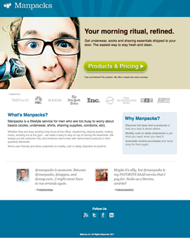
A great example of a focused landing page is

#4 – Large Photographic Backgrounds
There has been an increasing use of large photographic elements as the backgrounds on many websites. This is due to the growing importance of visuals to capture attention in our attention poor society. Images typically illicit strong emotions based on their colors and backgrounds. These designs are not for all businesses. They can be challenging to place content onto them. Design portfolios and creative websites typically use them but they can be very impactful if done well.
An example of such sites include:


